

Introduction
Cascading Style Sheets, fondly referred to as CSS, is a simple design language intended to simplify the process of making web pages presentable.
CSS handles the look and feel part of a web page. Using CSS, you can control the color of the text, the style of fonts, the spacing between paragraphs, how columns are sized and laid out, what background images or colors are used, layout designs,variations in display for different devices and screen sizes as well as a variety of other effects.
CSS is easy to learn and understand but it provides powerful control over the presentation of an HTML document. Most commonly, CSS is combined with the markup languages HTML or XHTML.
Advantages of CSS
CSS saves time − You can write CSS once and then reuse same sheet in multiple HTML pages. You can define a style for each HTML element and apply it to as many Web pages as you want.
Pages load faster − If you are using CSS, you do not need to write HTML tag attributes every time. Just write one CSS rule of a tag and apply it to all the occurrences of that tag. So less code means faster download times.
Easy maintenance − To make a global change, simply change the style, and all elements in all the web pages will be updated automatically.
Superior styles to HTML − CSS has a much wider array of attributes than HTML, so you can give a far better look to your HTML page in comparison to HTML attributes.
Multiple Device Compatibility − Style sheets allow content to be optimized for more than one type of device. By using the same HTML document, different versions of a website can be presented for handheld devices such as PDAs and cell phones or for printing.
Global web standards − Now HTML attributes are being deprecated and it is being recommended to use CSS. So its a good idea to start using CSS in all the HTML pages to make them compatible to future browsers.
Who Creates and Maintains CSS?
CSS is created and maintained through a group of people within the W3C called the CSS Working Group. The CSS Working Group creates documents called specifications. When a specification has been discussed and officially ratified by the W3C members, it becomes a recommendation.
These ratified specifications are called recommendations because the W3C has no control over the actual implementation of the language. Independent companies and organizations create that software.
NOTE − The World Wide Web Consortium, or W3C is a group that makes recommendations about how the Internet works and how it should evolve.
CSS Versions
Cascading Style Sheets level 1 (CSS1) came out of W3C as a recommendation in December 1996. This version describes the CSS language as well as a simple visual formatting model for all the HTML tags.
CSS2 became a W3C recommendation in May 1998 and builds on CSS1. This version adds support for media-specific style sheets e.g. printers and aural devices, downloadable fonts, element positioning and tables.
Syntax
CSS Syntax
A CSS rule-set consists of a selector and a declaration block:
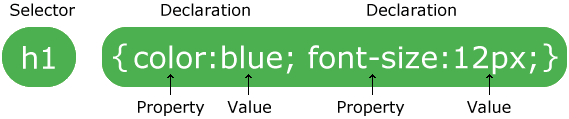
The selector points to the HTML element you want to style.
The declaration block contains one or more declarations separated by semicolons.
Each declaration includes a CSS property name and a value, separated by a colon.
A CSS declaration always ends with a semicolon, and declaration blocks are surrounded by curly braces.
Example
In this example all <p> elements will be center-aligned, with a red text color:
p {
color: red;
text-align: center;
}Example Explained
pis a selector in CSS (it points to the HTML element you want to style: <p>).coloris a property, andredis the property valuetext-alignis a property, andcenteris the property value
Inclusion
This is a heading
This is a paragraph.
It will produce the following result − Attributes Attributes associated with tags or rules defined in any external style sheet file. Any rule defined in tags will override rules defined in any external style sheet file. Any rule defined in external style sheet file takes lowest priority, and rules defined in this file will be applied only when above two rules are not applicable. Handling old Browsers There are still many old browsers who do not support CSS. So, we should take care while writing our Embedded CSS in an HTML document. The following snippet shows how you can use comment tags to hide CSS from older browsers − CSS Comments Many times, you may need to put additional comments in your style sheet blocks. So, it is very easy to comment any part in style sheet. You can simple put your comments inside /*.....this is a comment in style sheet.....*/. You can use /* ....*/ to comment multi-line blocks in similar way you do in C and C++ programming languages. Example Live DemoHello World!
It will produce the following result −Measurement Units
Before we start the actual exercise, we would like to give a brief idea about the CSS Measurement Units. CSS supports a number of measurements including absolute units such as inches, centimeters, points, and so on, as well as relative measures such as percentages and em units. You need these values while specifying various measurements in your Style rules e.g. border = "1px solid red". We have listed out all the CSS Measurement Units along with proper Examples − Unit Description Example % Defines a measurement as a percentage relative to another value, typically an enclosing element. p {font-size: 16pt; line-height: 125%;} cm Defines a measurement in centimeters. div {margin-bottom: 2cm;} em A relative measurement for the height of a font in em spaces. Because an em unit is equivalent to the size of a given font, if you assign a font to 12pt, each "em" unit would be 12pt; thus, 2em would be 24pt. p {letter-spacing: 7em;} ex This value defines a measurement relative to a font's x-height. The x-height is determined by the height of the font's lowercase letter x. p {font-size: 24pt; line-height: 3ex;} in Defines a measurement in inches. p {word-spacing: .15in;} mm Defines a measurement in millimeters. p {word-spacing: 15mm;} pc Defines a measurement in picas. A pica is equivalent to 12 points; thus, there are 6 picas per inch. p {font-size: 20pc;} pt Defines a measurement in points. A point is defined as 1/72nd of an inch. body {font-size: 18pt;} px Defines a measurement in screen pixels. p {padding: 25px;}
Colors
CSS uses color values to specify a color. Typically, these are used to set a color either for the foreground of an element (i.e., its text) or else for the background of the element. They can also be used to affect the color of borders and other decorative effects.
You can specify your color values in various formats. Following table lists all the possible formats −
| Format | Syntax | Example |
|---|---|---|
| Hex Code | #RRGGBB | p{color:#FF0000;} |
| Short Hex Code | #RGB | p{color:#6A7;} |
| RGB % | rgb(rrr%,ggg%,bbb%) | p{color:rgb(50%,50%,50%);} |
| RGB Absolute | rgb(rrr,ggg,bbb) | p{color:rgb(0,0,255);} |
| keyword | aqua, black, etc. | p{color:teal;} |
These formats are explained in more detail in the following sections −
CSS Colors - Hex Codes
A hexadecimal is a 6 digit representation of a color. The first two digits(RR) represent a red value, the next two are a green value(GG), and the last are the blue value(BB).
A hexadecimal value can be taken from any graphics software like Adobe Photoshop, Jasc Paintshop Pro, or even using Advanced Paint Brush.
Each hexadecimal code will be preceded by a pound or hash sign '#'. Following are the examples to use Hexadecimal notation.
| Color | Color HEX |
|---|---|
| #000000 | |
| #FF0000 | |
| #00FF00 | |
| #0000FF | |
| #FFFF00 | |
| #00FFFF | |
| #FF00FF | |
| #C0C0C0 | |
| #FFFFFF |
CSS Colors - Short Hex Codes
This is a shorter form of the six-digit notation. In this format, each digit is replicated to arrive at an equivalent six-digit value. For example: #6A7 becomes #66AA77.
A hexadecimal value can be taken from any graphics software like Adobe Photoshop, Jasc Paintshop Pro, or even using Advanced Paint Brush.
Each hexadecimal code will be preceded by a pound or hash sign '#'. Following are the examples to use Hexadecimal notation.
| Color | Color HEX |
|---|---|
| #000 | |
| #F00 | |
| #0F0 | |
| #0FF | |
| #FF0 | |
| #0FF | |
| #F0F | |
| #FFF |
CSS Colors - RGB Values
This color value is specified using the rgb( ) property. This property takes three values, one each for red, green, and blue. The value can be an integer between 0 and 255 or a percentage.
NOTE − All the browsers does not support rgb() property of color so it is recommended not to use it.
Following is the example to show few colors using RGB values.
| Color | Color RGB |
|---|---|
| rgb(0,0,0) | |
| rgb(255,0,0) | |
| rgb(0,255,0) | |
| rgb(0,0,255) | |
| rgb(255,255,0) | |
| rgb(0,255,255) | |
| rgb(255,0,255) | |
| rgb(192,192,192) | |
| rgb(255,255,255) |
Building Color Codes
You can build millions of color codes using our Color Code Builder. Check our HTML Color Code Builder. To use this tool, you would need a Java Enabled Browser.
Browser Safe Colors
Here is the list of 216 colors which are supposed to be most safe and computer independent colors. These colors vary from hexa code 000000 to FFFFFF. These colors are safe to use because they ensure that all computers would display the colors correctly when running a 256 color palette −
| 000000 | 000033 | 000066 | 000099 | 0000CC | 0000FF | |||||||||||||||||||||||||||||||||||||||||||||||||||||||||||||||||||||||||||||||||||||||||||||||||||||||||||||||||||||||||||||||||||||||||||||||||||||||||||||||||||||||||||||||||||||||||||||||||||||||||||||||||||||||||||||||||||||||||||||||||||||||||||||||||||||||||||||
| 003300 | 003333 | 003366 | 003399 | 0033CC | 0033FF | |||||||||||||||||||||||||||||||||||||||||||||||||||||||||||||||||||||||||||||||||||||||||||||||||||||||||||||||||||||||||||||||||||||||||||||||||||||||||||||||||||||||||||||||||||||||||||||||||||||||||||||||||||||||||||||||||||||||||||||||||||||||||||||||||||||||||||||
| 006600 | 006633 | 006666 | 006699 | 0066CC | 0066FF | |||||||||||||||||||||||||||||||||||||||||||||||||||||||||||||||||||||||||||||||||||||||||||||||||||||||||||||||||||||||||||||||||||||||||||||||||||||||||||||||||||||||||||||||||||||||||||||||||||||||||||||||||||||||||||||||||||||||||||||||||||||||||||||||||||||||||||||
| 009900 | 009933 | 009966 | 009999 | 0099CC | 0099FF | |||||||||||||||||||||||||||||||||||||||||||||||||||||||||||||||||||||||||||||||||||||||||||||||||||||||||||||||||||||||||||||||||||||||||||||||||||||||||||||||||||||||||||||||||||||||||||||||||||||||||||||||||||||||||||||||||||||||||||||||||||||||||||||||||||||||||||||
| 00CC00 | 00CC33 | 00CC66 | 00CC99 | 00CCCC | 00CCFF | |||||||||||||||||||||||||||||||||||||||||||||||||||||||||||||||||||||||||||||||||||||||||||||||||||||||||||||||||||||||||||||||||||||||||||||||||||||||||||||||||||||||||||||||||||||||||||||||||||||||||||||||||||||||||||||||||||||||||||||||||||||||||||||||||||||||||||||
| 00FF00 | 00FF33 | 00FF66 | 00FF99 | 00FFCC | 00FFFF | |||||||||||||||||||||||||||||||||||||||||||||||||||||||||||||||||||||||||||||||||||||||||||||||||||||||||||||||||||||||||||||||||||||||||||||||||||||||||||||||||||||||||||||||||||||||||||||||||||||||||||||||||||||||||||||||||||||||||||||||||||||||||||||||||||||||||||||
| 330000 | 330033 | 330066 | 330099 | 3300CC | 3300FF | |||||||||||||||||||||||||||||||||||||||||||||||||||||||||||||||||||||||||||||||||||||||||||||||||||||||||||||||||||||||||||||||||||||||||||||||||||||||||||||||||||||||||||||||||||||||||||||||||||||||||||||||||||||||||||||||||||||||||||||||||||||||||||||||||||||||||||||
| 333300 | 333333 | 333366 | 333399 | 3333CC | 3333FF | |||||||||||||||||||||||||||||||||||||||||||||||||||||||||||||||||||||||||||||||||||||||||||||||||||||||||||||||||||||||||||||||||||||||||||||||||||||||||||||||||||||||||||||||||||||||||||||||||||||||||||||||||||||||||||||||||||||||||||||||||||||||||||||||||||||||||||||
| 336600 | 336633 | 336666 | 336699 | 3366CC | 3366FF | |||||||||||||||||||||||||||||||||||||||||||||||||||||||||||||||||||||||||||||||||||||||||||||||||||||||||||||||||||||||||||||||||||||||||||||||||||||||||||||||||||||||||||||||||||||||||||||||||||||||||||||||||||||||||||||||||||||||||||||||||||||||||||||||||||||||||||||
| 339900 | 339933 | 339966 | 339999 | 3399CC | 3399FF | |||||||||||||||||||||||||||||||||||||||||||||||||||||||||||||||||||||||||||||||||||||||||||||||||||||||||||||||||||||||||||||||||||||||||||||||||||||||||||||||||||||||||||||||||||||||||||||||||||||||||||||||||||||||||||||||||||||||||||||||||||||||||||||||||||||||||||||
| 33CC00 | 33CC33 | 33CC66 | 33CC99 | 33CCCC | 33CCFF | |||||||||||||||||||||||||||||||||||||||||||||||||||||||||||||||||||||||||||||||||||||||||||||||||||||||||||||||||||||||||||||||||||||||||||||||||||||||||||||||||||||||||||||||||||||||||||||||||||||||||||||||||||||||||||||||||||||||||||||||||||||||||||||||||||||||||||||
| 33FF00 | 33FF33 | 33FF66 | 33FF99 | 33FFCC | 33FFFF | |||||||||||||||||||||||||||||||||||||||||||||||||||||||||||||||||||||||||||||||||||||||||||||||||||||||||||||||||||||||||||||||||||||||||||||||||||||||||||||||||||||||||||||||||||||||||||||||||||||||||||||||||||||||||||||||||||||||||||||||||||||||||||||||||||||||||||||
| 660000 | 660033 | 660066 | 660099 | 6600CC | 6600FF | |||||||||||||||||||||||||||||||||||||||||||||||||||||||||||||||||||||||||||||||||||||||||||||||||||||||||||||||||||||||||||||||||||||||||||||||||||||||||||||||||||||||||||||||||||||||||||||||||||||||||||||||||||||||||||||||||||||||||||||||||||||||||||||||||||||||||||||
| 663300 | 663333 | 663366 | 663399 | 6633CC | 6633FF | |||||||||||||||||||||||||||||||||||||||||||||||||||||||||||||||||||||||||||||||||||||||||||||||||||||||||||||||||||||||||||||||||||||||||||||||||||||||||||||||||||||||||||||||||||||||||||||||||||||||||||||||||||||||||||||||||||||||||||||||||||||||||||||||||||||||||||||
| 666600 | 666633 | 666666 | 666699 | 6666CC | 6666FF | |||||||||||||||||||||||||||||||||||||||||||||||||||||||||||||||||||||||||||||||||||||||||||||||||||||||||||||||||||||||||||||||||||||||||||||||||||||||||||||||||||||||||||||||||||||||||||||||||||||||||||||||||||||||||||||||||||||||||||||||||||||||||||||||||||||||||||||
| 669900 | 669933 | 669966 | 669999 | 6699CC | 6699FF | |||||||||||||||||||||||||||||||||||||||||||||||||||||||||||||||||||||||||||||||||||||||||||||||||||||||||||||||||||||||||||||||||||||||||||||||||||||||||||||||||||||||||||||||||||||||||||||||||||||||||||||||||||||||||||||||||||||||||||||||||||||||||||||||||||||||||||||
| 66CC00 | 66CC33 | 66CC66 | 66CC99 | 66CCCC | 66CCFF | |||||||||||||||||||||||||||||||||||||||||||||||||||||||||||||||||||||||||||||||||||||||||||||||||||||||||||||||||||||||||||||||||||||||||||||||||||||||||||||||||||||||||||||||||||||||||||||||||||||||||||||||||||||||||||||||||||||||||||||||||||||||||||||||||||||||||||||
| 66FF00 | 66FF33 | 66FF66 | 66FF99 | 66FFCC | 66FFFF | |||||||||||||||||||||||||||||||||||||||||||||||||||||||||||||||||||||||||||||||||||||||||||||||||||||||||||||||||||||||||||||||||||||||||||||||||||||||||||||||||||||||||||||||||||||||||||||||||||||||||||||||||||||||||||||||||||||||||||||||||||||||||||||||||||||||||||||
| 990000 | 990033 | 990066 | 990099 | 9900CC | 9900FF | |||||||||||||||||||||||||||||||||||||||||||||||||||||||||||||||||||||||||||||||||||||||||||||||||||||||||||||||||||||||||||||||||||||||||||||||||||||||||||||||||||||||||||||||||||||||||||||||||||||||||||||||||||||||||||||||||||||||||||||||||||||||||||||||||||||||||||||
| 993300 | 993333 | 993366 | 993399 | 9933CC | 9933FF | |||||||||||||||||||||||||||||||||||||||||||||||||||||||||||||||||||||||||||||||||||||||||||||||||||||||||||||||||||||||||||||||||||||||||||||||||||||||||||||||||||||||||||||||||||||||||||||||||||||||||||||||||||||||||||||||||||||||||||||||||||||||||||||||||||||||||||||
| 996600 | 996633 | 996666 | 996699 | 9966CC | 9966FF | |||||||||||||||||||||||||||||||||||||||||||||||||||||||||||||||||||||||||||||||||||||||||||||||||||||||||||||||||||||||||||||||||||||||||||||||||||||||||||||||||||||||||||||||||||||||||||||||||||||||||||||||||||||||||||||||||||||||||||||||||||||||||||||||||||||||||||||
| 999900 | 999933 | 999966 | 999999 | 9999CC | 9999FF | |||||||||||||||||||||||||||||||||||||||||||||||||||||||||||||||||||||||||||||||||||||||||||||||||||||||||||||||||||||||||||||||||||||||||||||||||||||||||||||||||||||||||||||||||||||||||||||||||||||||||||||||||||||||||||||||||||||||||||||||||||||||||||||||||||||||||||||
| 99CC00 | 99CC33 | 99CC66 | 99CC99 | 99CCCC | 99CCFF | |||||||||||||||||||||||||||||||||||||||||||||||||||||||||||||||||||||||||||||||||||||||||||||||||||||||||||||||||||||||||||||||||||||||||||||||||||||||||||||||||||||||||||||||||||||||||||||||||||||||||||||||||||||||||||||||||||||||||||||||||||||||||||||||||||||||||||||
| 99FF00 | 99FF33 | 99FF66 | 99FF99 | 99FFCC | 99FFFF | |||||||||||||||||||||||||||||||||||||||||||||||||||||||||||||||||||||||||||||||||||||||||||||||||||||||||||||||||||||||||||||||||||||||||||||||||||||||||||||||||||||||||||||||||||||||||||||||||||||||||||||||||||||||||||||||||||||||||||||||||||||||||||||||||||||||||||||
| CC0000 | CC0033 | CC0066 | CC0099 | CC00CC | CC00FF | |||||||||||||||||||||||||||||||||||||||||||||||||||||||||||||||||||||||||||||||||||||||||||||||||||||||||||||||||||||||||||||||||||||||||||||||||||||||||||||||||||||||||||||||||||||||||||||||||||||||||||||||||||||||||||||||||||||||||||||||||||||||||||||||||||||||||||||
| CC3300 |
| Sr.No. | Value & Description |
|---|---|
| 1 |
none NA |
| 2 |
disc (default) A filled-in circle |
| 3 |
circle An empty circle |
| 4 |
square A filled-in square |
Here are the values, which can be used for an ordered list −
| Value | Description | Example |
|---|---|---|
| decimal | Number | 1,2,3,4,5 |
| decimal-leading-zero | 0 before the number | 01, 02, 03, 04, 05 |
| lower-alpha | Lowercase alphanumeric characters | a, b, c, d, e |
| upper-alpha | Uppercase alphanumeric characters | A, B, C, D, E |
| lower-roman | Lowercase Roman numerals | i, ii, iii, iv, v |
| upper-roman | Uppercase Roman numerals | I, II, III, IV, V |
| lower-greek | The marker is lower-greek | alpha, beta, gamma |
| lower-latin | The marker is lower-latin | a, b, c, d, e |
| upper-latin | The marker is upper-latin | A, B, C, D, E |
| hebrew | The marker is traditional Hebrew numbering | |
| armenian | The marker is traditional Armenian numbering | |
| georgian | The marker is traditional Georgian numbering | |
| cjk-ideographic | The marker is plain ideographic numbers | |
| hiragana | The marker is hiragana | a, i, u, e, o, ka, ki |
| katakana | The marker is katakana | A, I, U, E, O, KA, KI |
| hiragana-iroha | The marker is hiragana-iroha | i, ro, ha, ni, ho, he, to |
| katakana-iroha | The marker is katakana-iroha | I, RO, HA, NI, HO, HE, TO |
Here is an example −
<html> <head> </head> <body> <ul style = "list-style-type:circle;"> <li>Maths</li> <li>Social Science</li> <li>Physics</li> </ul> <ul style = "list-style-type:square;"> <li>Maths</li> <li>Social Science</li> <li>Physics</li> </ul> <ol style = "list-style-type:decimal;"> <li>Maths</li> <li>Social Science</li> <li>Physics</li> </ol> <ol style = "list-style-type:lower-alpha;"> <li>Maths</li> <li>Social Science</li> <li>Physics</li> </ol> <ol style = "list-style-type:lower-roman;"> <li>Maths</li> <li>Social Science</li> <li>Physics</li> </ol> </body></html>
It will produce the following result −
The list-style-position Property
The list-style-position property indicates whether the marker should appear inside or outside of the box containing the bullet points. It can have one the two values −
| Sr.No. | Value & Description |
|---|---|
| 1 |
none NA |
| 2 |
inside If the text goes onto a second line, the text will wrap underneath the marker. It will also appear indented to where the text would have started if the list had a value of outside. |
| 3 |
outside If the text goes onto a second line, the text will be aligned with the start of the first line (to the right of the bullet). |
Here is an example −
<html> <head> </head> <body> <ul style = "list-style-type:circle; list-stlye-position:outside;"> <li>Maths</li> <li>Social Science</li> <li>Physics</li> </ul> <ul style = "list-style-type:square;list-style-position:inside;"> <li>Maths</li> <li>Social Science</li> <li>Physics</li> </ul> <ol style = "list-style-type:decimal;list-stlye-position:outside;"> <li>Maths</li> <li>Social Science</li> <li>Physics</li> </ol> <ol style = "list-style-type:lower-alpha;list-style-position:inside;"> <li>Maths</li> <li>Social Science</li> <li>Physics</li> </ol> </body></html>
It will produce the following result −
Padding
The padding property allows you to specify how much space should appear between the content of an element and its border −
The value of this attribute should be either a length, a percentage, or the word inherit. If the value is inherit, it will have the same padding as its parent element. If a percentage is used, the percentage is of the containing box.
The following CSS properties can be used to control lists. You can also set different values for the padding on each side of the box using the following properties −
-
The padding-bottom specifies the bottom padding of an element.
-
The padding-top specifies the top padding of an element.
-
The padding-left specifies the left padding of an element.
-
The padding-right specifies the right padding of an element.
-
The padding serves as shorthand for the preceding properties.
Now, we will see how to use these properties with examples.
The padding-bottom Property
The padding-bottom property sets the bottom padding (space) of an element. This can take a value in terms of length of %.
Here is an example −
<html> <head> </head> <body> <p style = "padding-bottom: 15px; border:1px solid black;"> This is a paragraph with a specified bottom padding </p> <p style = "padding-bottom: 5%; border:1px solid black;"> This is another paragraph with a specified bottom padding in percent </p> </body></html>
It will produce the following result −
The padding-top Property
The padding-top property sets the top padding (space) of an element. This can take a value in terms of length of %.
Here is an example −
<html> <head> </head> <body> <p style = "padding-top: 15px; border:1px solid black;"> This is a paragraph with a specified top padding </p> <p style = "padding-top: 5%; border:1px solid black;"> This is another paragraph with a specified top padding in percent </p> </body></html>
It will produce the following result −
The padding-left Property
The padding-left property sets the left padding (space) of an element. This can take a value in terms of length of %.
Here is an example −
<html> <head> </head> <body> <p style = "padding-left: 15px; border:1px solid black;"> This is a paragraph with a specified left padding </p> <p style = "padding-left: 15%; border:1px solid black;"> This is another paragraph with a specified left padding in percent </p> </body></html>
It will produce the following result −
The padding-right Property
The padding-right property sets the right padding (space) of an element. This can take a value in terms of length of %.
Here is an example −
<html> <head> </head> <body> <p style = "padding-right: 15px; border:1px solid black;"> This is a paragraph with a specified right padding </p> <p style = "padding-right: 5%; border:1px solid black;"> This is another paragraph with a specified right padding in percent </p> </body></html>
It will produce the following result −
The Padding Property
The padding property sets the left, right, top and bottom padding (space) of an element. This can take a value in terms of length of %.
Here is an example −
<html> <head> </head> <body> <p style = "padding: 15px; border:1px solid black;"> all four padding will be 15px </p> <p style = "padding:10px 2%; border:1px solid black;"> top and bottom padding will be 10px, left and right padding will be 2% of the total width of the document. </p> <p style = "padding: 10px 2% 10px; border:1px solid black;"> top padding will be 10px, left and right padding will be 2% of the total width of the document, bottom padding will be 10px </p> <p style = "padding: 10px 2% 10px 10px; border:1px solid black;"> top padding will be 10px, right padding will be 2% of the total width of the document, bottom padding and top padding will be 10px </p> </body></html>
It will produce the following result −
Cursors
The cursor property of CSS allows you to specify the type of cursor that should be displayed to the user.
One good usage of this property is in using images for submit buttons on forms. By default, when a cursor hovers over a link, the cursor changes from a pointer to a hand. However, it does not change form for a submit button on a form. Therefore, whenever someone hovers over an image that is a submit button, it provides a visual clue that the image is clickable.
The following table shows the possible values for the cursor property −
| Sr.No. | Value & Description |
|---|---|
| 1 |
auto Shape of the cursor depends on the context area it is over. For example an I over text, a hand over a link, and so on... |
| 2 |
crosshair A crosshair or plus sign |
| 3 |
default An arrow |
| 4 |
pointer A pointing hand (in IE 4 this value is hand) |
| 5 |
move The I bar |
| 6 |
e-resize The cursor indicates that an edge of a box is to be moved right (east) |
| 7 |
ne-resize The cursor indicates that an edge of a box is to be moved up and right (north/east) |
| 8 |
nw-resize The cursor indicates that an edge of a box is to be moved up and left (north/west) |
| 9 |
n-resize The cursor indicates that an edge of a box is to be moved up (north) |
| 10 |
se-resize The cursor indicates that an edge of a box is to be moved down and right (south/east) |
| 11 |
sw-resize The cursor indicates that an edge of a box is to be moved down and left (south/west) |
| 12 |
s-resize The cursor indicates that an edge of a box is to be moved down (south) |
| 13 |
w-resize The cursor indicates that an edge of a box is to be moved left (west) |
| 14 |
text The I bar |
| 15 |
wait An hour glass |
| 16 |
help A question mark or balloon, ideal for use over help buttons |
| 17 |
<url> The source of a cursor image file |
NOTE − You should try to use only these values to add helpful information for users, and in places, they would expect to see that cursor. For example, using the crosshair when someone hovers over a link can confuse visitors.
Here is an example −
<html> <head> </head> <body> <p>Move the mouse over the words to see the cursor change:</p> <div style = "cursor:auto">Auto</div> <div style = "cursor:crosshair">Crosshair</div> <div style = "cursor:default">Default</div> <div style = "cursor:pointer">Pointer</div> <div style = "cursor:move">Move</div> <div style = "cursor:e-resize">e-resize</div> <div style = "cursor:ne-resize">ne-resize</div> <div style = "cursor:nw-resize">nw-resize</div> <div style = "cursor:n-resize">n-resize</div> <div style = "cursor:se-resize">se-resize</div> <div style = "cursor:sw-resize">sw-resize</div> <div style = "cursor:s-resize">s-resize</div> <div style = "cursor:w-resize">w-resize</div> <div style = "cursor:text">text</div> <div style = "cursor:wait">wait</div> <div style = "cursor:help">help</div> </body></html>
It will produce the following result −
Pseudo Class
x" style="background: rgb(238, 238, 238) !important; border: 1px solid rgb(214, 214, 214) !important; color: rgba(0, 0, 0, 0.87); font-family: Arial, Verdana, Tahoma; font-size: 14px; font-style: normal; font-variant-ligatures: normal; font-variant-caps: normal; font-weight: 400; letter-spacing: normal; orphans: 2; text-align: start; text-indent: 0px; text-transform: none; white-space: normal; widows: 2; word-spacing: 0px; -webkit-text-stroke-width: 0px; text-decoration-style: initial; text-decoration-color: initial;">
The :hover pseudo-class
The following example demonstrates how to use the :hover class to change the color of links when we bring a mouse pointer over that link. Possible values could be any color name in any valid format.
<html> <head> <style type = "text/css"> a:hover {color: #FFCC00} </style> </head> <body> <a href = "">Bring Mouse Here</a> </body></html>
It will produce the following link. Now you bring your mouse over this link and you will see that it changes its color to yellow.
The :active pseudo-class
The following example demonstrates how to use the :active class to change the color of active links. Possible values could be any color name in any valid format.
<html> <head> <style type = "text/css"> a:active {color: #FF00CC} </style> </head> <body> <a href = "">Click This Link</a> </body></html>
It will produce the following link. When a user clicks it, the color changes to pink.
The :focus pseudo-class
The following example demonstrates how to use the :focus class to change the color of focused links. Possible values could be any color name in any valid format.
<html> <head> <style type = "text/css"> a:focus {color: #0000FF} </style> </head> <body> <a href = "">Click this Link</a> </body></html>
It will produce the following link. When this link gets focused, its color changes to orange. The color changes back when it loses focus.
The :first-child pseudo-class
The :first-child pseudo-class matches a specified element that is the first child of another element and adds special style to that element that is the first child of some other element.
To make :first-child work in IE <!DOCTYPE> must be declared at the top of document.
For example, to indent the first paragraph of all <div> elements, you could use this definition −
<html> <head> <style type = "text/css"> div > p:first-child { text-indent: 25px; } </style> </head> <body> <div> <p>First paragraph in div. This paragraph will be indented</p> <p>Second paragraph in div. This paragraph will not be indented</p> </div> <p>But it will not match the paragraph in this HTML:</p> <div> <h3>Heading</h3> <p>The first paragraph inside the div. This paragraph will not be effected.</p> </div> </body></html>
It will produce the following result −
The :lang pseudo-class
The language pseudo-class :lang, allows constructing selectors based on the language setting for specific tags.
This class is useful in documents that must appeal to multiple languages that have different conventions for certain language constructs. For example, the French language typically uses angle brackets (< and >) for quoting purposes, while the English language uses quote marks (' and ').
In a document that needs to address this difference, you can use the :lang pseudo-class to change the quote marks appropriately. The following code changes the <blockquote> tag appropriately for the language being used −
<html> <head> <style type = "text/css"> /* Two levels of quotes for two languages*/ :lang(en) { quotes: '"' '"' "'" "'"; } :lang(fr) { quotes: "<<" ">>" "<" ">"; } </style> </head> <body> <p>...<q lang = "fr">A quote in a paragraph</q>...</p> </body></html>
The :lang selectors will apply to all the elements in the document. However, not all elements make use of the quotes property, so the effect will be transparent for most elements.
It will produce the following result −
Pseudo Elements
CSS pseudo-elements are used to add special effects to some selectors. You do not need to use JavaScript or any other script to use those effects. A simple syntax of pseudo-element is as follows −
selector:pseudo-element {property: value}
CSS classes can also be used with pseudo-elements −
selector.class:pseudo-element {property: value}
The most commonly used pseudo-elements are as follows −
| Sr.No. | Value & Description |
|---|---|
| 1 |
:first-line Use this element to add special styles to the first line of the text in a selector. |
| 2 |
:first-letter Use this element to add special style to the first letter of the text in a selector. |
| 3 |
:before Use this element to insert some content before an element. |
| 4 |
:after Use this element to insert some content after an element. |
The :first-line pseudo-element
The following example demonstrates how to use the :first-line element to add special effects to the first line of elements in the document.
<html> <head> <style type = "text/css"> p:first-line { text-decoration: underline; } p.noline:first-line { text-decoration: none; } </style> </head> <body> <p class = "noline"> This line would not have any underline because this belongs to nline class. </p> <p> The first line of this paragraph will be underlined as defined in the CSS rule above. Rest of the lines in this paragraph will remain normal. This example shows how to use :first-line pseduo element to give effect to the first line of any HTML element. </p> </body></html>
It will produce the following link −
The :first-letter pseudo-element
The following example demonstrates how to use the :first-letter element to add special effects to the first letter of elements in the document.
<html> <head> <style type = "text/css"> p:first-letter { font-size: 5em; } p.normal:first-letter { font-size: 10px; } </style> </head> <body> <p class = "normal"> First character of this paragraph will be normal and will have font size 10 px; </p> <p> The first character of this paragraph will be 5em big as defined in the CSS rule above. Rest of the characters in this paragraph will remain normal. This example shows how to use :first-letter pseduo element to give effect to the first characters of any HTML element. </p> </body></html>
It will produce the following black link −
The :before pseudo-element
The following example demonstrates how to use the :before element to add some content before any element.
<html> <head> <style type = "text/css"> p:before { content: url(/images/bullet.gif) } </style> </head> <body> <p> This line will be preceded by a bullet.</p> <p> This line will be preceded by a bullet.</p> <p> This line will be preceded by a bullet.</p> </body></html>
It will produce the following black link −
The :after pseudo-element
The following example demonstrates how to use the :after element to add some content after any element.
<html> <head> <style type = "text/css"> p:after { content: url(/images/bullet.gif) } </style> </head> <body> <p> This line will be succeeded by a bullet.</p> <p> This line will be succeeded by a bullet.</p> <p> This line will be succeeded by a bullet.</p> </body></html>
It will produce the following black link −
Validation
Validation is the process of checking something against a rule. When you are a beginner, it is very common that you will commit many mistakes in writing your CSS rules. How you will make sure whatever you have written is 100% accurate and up to the W3 quality standards?
If you use CSS, your code needs to be correct. Improper code may cause unexpected results in how your page looks or functions.
But if you want to validate your CSS style sheet embedded in an (X)HTML document, you should first check that the (X)HTML you use is valid.
Tool to check the validity of (X)HTML document: Validate (X)HTML document.
You can use the following tools to check the validity of your CSS.

|
W3C CSS Validator (World Wide Web Consortium), This validator checks your css by either file upload, direct input, or using URI - one page at a time. This validator helps you to locate all the errors in your CSS. |

|
The WDG CSS check validator, lets you validate your css by direct input, file upload, and using URI. Errors will be listed by line and column numbers if you have any. Errors usually come with links to explain the reason of error. |
A CSS validator checks your Cascading Style Sheets to make sure that they comply with the CSS standards set by the W3 Consortium. There are a few validators which will also tell you which CSS features are supported by which browsers (since not all browsers are equal in their CSS implementation).
Why Validate Your HTML Code?
There are a number of reasons why you should validate your code. But major ones are −
-
It Helps Cross-Browser, Cross-Platform, and Future Compatibility.
-
A good quality website increases search engine visibility.
-
Professionalism: As a web developer, your code should not raise errors while seen by the visitors.
Rounded Corners
CSS3 Rounded corners are used to add special colored corner to body or text by using the border-radius property.A simple syntax of rounded corners is as follows −
#rcorners7 { border-radius: 60px/15px; background: #FF0000; padding: 20px; width: 200px; height: 150px; }
The following table shows the possible values for Rounded corners as follows −
| Sr.No. | Value & Description |
|---|---|
| 1 |
border-radius Use this element for setting four boarder radius property |
| 2 |
border-top-left-radius Use this element for setting the boarder of top left corner |
| 3 |
border-top-right-radius Use this element for setting the boarder of top right corner |
| 4 |
border-bottom-right-radius Use this element for setting the boarder of bottom right corner |
| 5 |
border-bottom-left-radius Use this element for setting the boarder of bottom left corner |
Example
This property can have three values. The following example uses both the values −
<html> <head> <style> #rcorners1 { border-radius: 25px; background: #8AC007; padding: 20px; width: 200px; height: 150px; } #rcorners2 { border-radius: 25px; border: 2px solid #8AC007; padding: 20px; width: 200px; height: 150px; } #rcorners3 { border-radius: 25px; background: url(/css/images/logo.png); background-position: left top; background-repeat: repeat; padding: 20px; width: 200px; height: 150px; } </style> </head> <body> <p id = "rcorners1">Rounded corners!</p> <p id = "rcorners2">Rounded corners!</p> <p id = "rcorners3">Rounded corners!</p> </body></html>
It will produce the following result −
Each Corner property
We can specify the each corner property as shown below example −
<html> <head> <style> #rcorners1 { border-radius: 15px 50px 30px 5px; background: #a44170; padding: 20px; width: 100px; height: 100px; } #rcorners2 { border-radius: 15px 50px 30px; background: #a44170; padding: 20px; width: 100px; height: 100px; } #rcorners3 { border-radius: 15px 50px; background: #a44170; padding: 20px; width: 100px; height: 100px; } </style> </head> <body> <p id = "rcorners1"></p> <p id = "rcorners2"></p> <p id = "rcorners3"></p> </body><body>
It will produce the following result −
2D Transformation
2D transforms are used to re-change the element structure as translate, rotate, scale, and skew.
The following table has contained common values which are used in 2D transforms −
| Sr.No. | Value & Description |
|---|---|
| 1 |
matrix(n,n,n,n,n,n) Used to defines matrix transforms with six values |
| 2 |
translate(x,y) Used to transforms the element along with x-axis and y-axis |
| 3 |
translateX(n) Used to transforms the element along with x-axis |
| 4 |
translateY(n) Used to transforms the element along with y-axis |
| 5 |
scale(x,y) Used to change the width and height of element |
| 6 |
scaleX(n) Used to change the width of element |
| 7 |
scaleY(n) Used to change the height of element |
| 8 |
rotate(angle) Used to rotate the element based on an angle |
| 9 |
skewX(angle) Used to defines skew transforms along with x axis |
| 10 |
skewY(angle) Used to defines skew transforms along with y axis |
The following examples are shown the sample of all above properties.
Rotate 20 degrees
Box rotation with 20 degrees angle as shown below −
<html> <head> <style> div { width: 300px; height: 100px; background-color: pink; border: 1px solid black; } div#myDiv { /* IE 9 */ -ms-transform: rotate(20deg); /* Safari */ -webkit-transform: rotate(20deg); /* Standard syntax */ transform: rotate(20deg); } </style> </head> <body> <div> Tutorials point.com. </div> <div id = "myDiv"> Tutorials point.com </div> </body></html>
It will produce the following result −
Rotate -20 degrees
Box rotation with -20 degrees angle as shown below −
<html> <head> <style> div { width: 300px; height: 100px; background-color: pink; border: 1px solid black; } div#myDiv { /* IE 9 */ -ms-transform: rotate(-20deg); /* Safari */ -webkit-transform: rotate(-20deg); /* Standard syntax */transform: rotate(-20deg); } </style> </head> <body> <div> Tutorials point.com. </div> <div id = "myDiv"> Tutorials point.com </div> </body></html>
It will produce the following result −
Skew X axis
Box rotation with skew x-axis as shown below −
<html> <head> <style> div { width: 300px; height: 100px; background-color: pink; border: 1px solid black; } div#skewDiv { /* IE 9 */ -ms-transform: skewX(20deg); /* Safari */ -webkit-transform: skewX(20deg); /* Standard syntax */transform: skewX(20deg); } </style> </head> <body> <div> Tutorials point.com. </div> <div id = "skewDiv"> Tutorials point.com </div> </body></html>
It will produce the following result −
Skew Y axis
Box rotation with skew y-axis as shown below −
<html> <head> <style> div { width: 300px; height: 100px; background-color: pink; border: 1px solid black; } div#skewDiv { /* IE 9 */ -ms-transform: skewY(20deg); /* Safari */ -webkit-transform: skewY(20deg); /* Standard syntax */transform: skewY(20deg); } </style> </head> <body> <div> Tutorials point.com. </div> <div id = "skewDiv"> Tutorials point.com </div> </body></html>
It will produce the following result −
Matrix transform
Box rotation with Matrix transforms as shown below −
<html> <head> <style> div { width: 300px; height: 100px; background-color: pink; border: 1px solid black; } div#myDiv1 { /* IE 9 */ -ms-transform: matrix(1, -0.3, 0, 1, 0, 0); /* Safari */ -webkit-transform: matrix(1, -0.3, 0, 1, 0, 0); /* Standard syntax */ transform: matrix(1, -0.3, 0, 1, 0, 0); } </style> </head> <body> <div> Tutorials point.com. </div> <div id = "myDiv1"> Tutorials point.com </div> </body></html>
3D Transformation
CSS 3D Transforms
CSS also supports 3D transformations.
Mouse over the elements below to see the difference between a 2D and a 3D transformation:
In this chapter you will learn about the following CSS property:
-
transform
Browser Support
The numbers in the table specify the first browser version that fully supports the property.
| Property |
|
|
|
|
|
|---|---|---|---|---|---|
| transform | 36.0
|
10.0
|
16.0
|
9.0
|
23.0
|
CSS 3D Transforms Methods
With the CSS
transform property you can use the following 3D transformation methods:
-
rotateX() -
rotateY() -
rotateZ()
The rotateX() Method
The
rotateX() method rotates an element around its X-axis at a given degree:
Example
#myDiv {
transform: rotateX(150deg);
}
The rotateY() Method
The
rotateY() method rotates an element around its Y-axis at a given degree:
Example
#myDiv {
transform: rotateY(130deg);
}
The rotateZ() Method
The
rotateZ() method rotates an element around its Z-axis at a given degree:
Example
#myDiv {
transform: rotateZ(90deg);
}
Test Yourself with Exercises!
CSS Transform Properties
The following table lists all the 3D transform properties:
| Property | Description |
|---|---|
| transform | Applies a 2D or 3D transformation to an element |
| transform-origin | Allows you to change the position on transformed elements |
| transform-style | Specifies how nested elements are rendered in 3D space |
| perspective | Specifies the perspective on how 3D elements are viewed |
| perspective-origin | Specifies the bottom position of 3D elements |
| backface-visibility | Defines whether or not an element should be visible when not facing the screen |
CSS 3D Transform Methods
| Function | Description |
|---|---|
| matrix3d
( n,n,n,n,n,n,n,n,n,n,n,n,n,n,n,n) |
Defines a 3D transformation, using a 4x4 matrix of 16 values |
| translate3d( x,y,z) | Defines a 3D translation |
| translateX( x) | Defines a 3D translation, using only the value for the X-axis |
| translateY( y) | Defines a 3D translation, using only the value for the Y-axis |
| translateZ( z) | Defines a 3D translation, using only the value for the Z-axis |
| scale3d( x,y,z) | Defines a 3D scale transformation |
| scaleX( x) | Defines a 3D scale transformation by giving a value for the X-axis |
| scaleY( y) | Defines a 3D scale transformation by giving a value for the Y-axis |
| scaleZ( z) | Defines a 3D scale transformation by giving a value for the Z-axis |
| rotate3d( x,y,z,angle) | Defines a 3D rotation |
| rotateX( angle) | Defines a 3D rotation along the X-axis |
| rotateY( angle) | Defines a 3D rotation along the Y-axis |
| rotateZ( angle) | Defines a 3D rotation along the Z-axis |
| perspective( n) | Defines a perspective view for a 3D transformed element |
|
|
|
Animation
CSS Animations
CSS allows animation of HTML elements without using JavaScript or Flash!
In this chapter you will learn about the following properties:
-
@keyframes -
animation-name -
animation-duration -
animation-delay -
animation-iteration-count -
animation-direction -
animation-timing-function -
animation-fill-mode -
animation
Browser Support for Animations
The numbers in the table specify the first browser version that fully supports the property.
| Property |
|
|
|
|
|
|---|---|---|---|---|---|
| @keyframes | 43.0 | 10.0 | 16.0 | 9.0 | 30.0 |
| animation-name | 43.0 | 10.0 | 16.0 | 9.0 | 30.0 |
| animation-duration | 43.0 | 10.0 | 16.0 | 9.0 | 30.0 |
| animation-delay | 43.0 | 10.0 | 16.0 | 9.0 | 30.0 |
| animation-iteration-count | 43.0 | 10.0 | 16.0 | 9.0 | 30.0 |
| animation-direction | 43.0 | 10.0 | 16.0 | 9.0 | 30.0 |
| animation-timing-function | 43.0 | 10.0 | 16.0 | 9.0 | 30.0 |
| animation-fill-mode | 43.0 | 10.0 | 16.0 | 9.0 | 30.0 |
| animation | 43.0 | 10.0 | 16.0 | 9.0 | 30.0 |
Browser Specific Prefixes
Some older browsers need specific prefixes (-webkit-) to understand the animation properties:
Example
div {
width: 100px;
height: 100px;
background-color: red;
animation-name: example;
animation-duration: 4s;
}
@keyframes example {
from {background-color: red;}
to {background-color: yellow;}
}
What are CSS Animations?
An animation lets an element gradually change from one style to another.
You can change as many CSS properties you want, as many times you want.
To use CSS animation, you must first specify some keyframes for the animation.
Keyframes hold what styles the element will have at certain times.
The @keyframes Rule
When you specify CSS styles inside the
@keyframes rule, the animation will gradually change from the current style to the new style at certain times.
To get an animation to work, you must bind the animation to an element.
The following example binds the "example" animation to the <div> element. The animation will last for 4 seconds, and it will gradually change the background-color of the <div> element from "red" to "yellow":
Example
/* The animation code */
@keyframes example {
from {background-color: red;}
to {background-color: yellow;}
}
/* The element to apply the animation to */
div {
width: 100px;
height: 100px;
background-color: red;
animation-name: example;
animation-duration: 4s;
}
Note: The
animation-duration property defines how long time an animation should take to complete. If the
animation-duration property is not specified, no animation will occur, because the default value is 0s (0 seconds).
In the example above we have specified when the style will change by using the keywords "from" and "to" (which represents 0% (start) and 100% (complete)).
It is also possible to use percent. By using percent, you can add as many style changes as you like.
The following example will change the background-color of the <div> element when the animation is 25% complete, 50% complete, and again when the animation is 100% complete:
Example
/* The animation code */
@keyframes example {
0% {background-color: red;}
25% {background-color: yellow;}
50% {background-color: blue;}
100% {background-color: green;}
}
/* The element to apply the animation to */
div {
width: 100px;
height: 100px;
background-color: red;
animation-name: example;
animation-duration: 4s;
}
0 Comments: